Pretty in Pastels
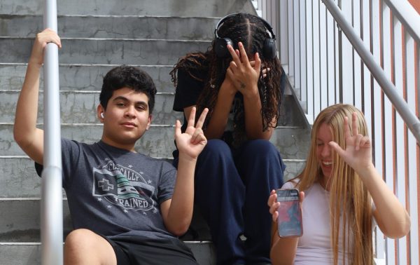
photo by Bethany Barker
Chay’s Closet is a recurring column where Staff Reporter Chanson Cadet shares her thoughts on the most recent trends in fashion.
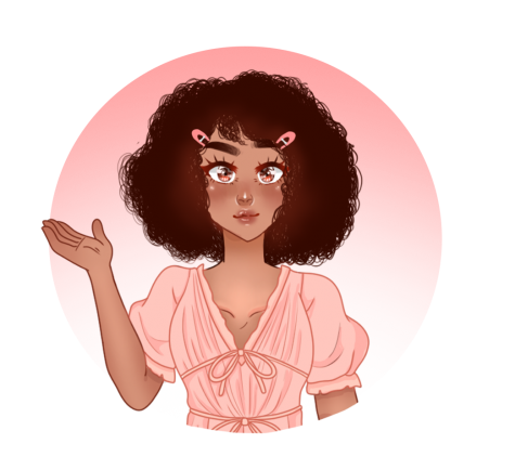
As the weather gets warmer and the end of school draws closer, the stress and tension that builds after excruciating eight-hour days can finally melt away to reveal to first glimpses of actual joy. If this happiness could be defined by a color, it would most certainly be pastel. A nice spring green, sunshine yellow, or a pretty pink will bring a smile to anyone’s face.
Pastels are a lighter, toned-down version of colors that are naturally calming and reflective of childhood nostalgia with the bright and inspiring colors of youthful kid’s clothing.
With vaccines rolling in, and the cargo ship that was blocking the Suez Canal finally being released, pastels are what we need to lighten the mood. The pastel color trend failed to stick in September, and an attempt to make light colors the newest fad during winter was quickly brushed over as nudes and browns were embraced as the new black and white.
Brown, in truth, is an amazing color that almost anyone can pull off, and its recent popularity is well deserved. However, it is time for pastels to take their place under the spotlight.
This trend can be found most notoriously in the “kawaii” aesthetic which is known for being“cute,” “happy,” and “positive.”
My issue with the dismissal of pastels is that people are missing out on looking like they belong in their favorite childhood cartoons, especially any in the Sanrio world. Hello Kitty and Bloom from “Winx Club” would never be caught dead in a drab, all-neutral outfit. Truthfully, pastels are not appropriate for all settings, like a funeral or office, but that should not hinder you from adding more cheerful colors into your everyday wardrobe.
Although pastels are not the classic black and white, they match just as easily. The soft hues of pastels can be mixed and matched while still looking monotone. Baby pink with light green, lilac, and yellow, light blue and orange, pastels make it easy to have colorful outfits without having to worry about a clashing color scheme. It is the same with clashing patterns, as the toned-down colors allow you to explore new combinations without looking loud.
Pastels have yet to receive the recognition they deserve. After the year we have had, we deserve to see calming and playful colors emerge from the drab fashion seasons of the past. We deserve to be reminded of our childhood when the only issue we faced was whether or not we would be allowed to stay up till 8 p.m. to watch the newest episode of “Fairly Odd Parents.”

Your donation will support the student journalists of Hagerty High School. We are an ad-free publication, and your contribution helps us publish six issues of the BluePrint and cover our annual website hosting costs. Thank you so much!


